This July I am I am taking a Photopgraphy course (This one) by Mike Brown
He has some great free videos on his site if you like photography check them out.
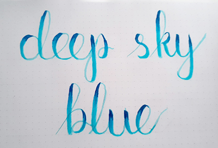
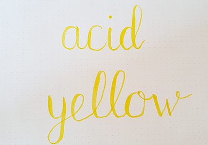
I also compleating a lettering challange by dawn nicole as below,
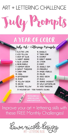
Here is day 1 of July's lettering challange
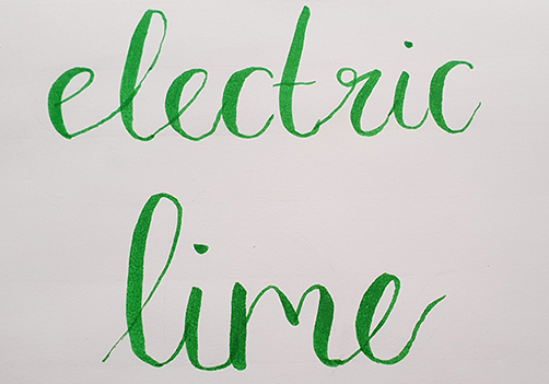
Not a very creative take on the challage I grant you, but they say it's the taking part that matters. Also more pratice is needed, much, much more, my letterforms are not the best, and those e's are tricky little things :( but I hope with daily pratice I will get better.
I am also trying to pratice gratitude so today I am gratful that
I am also trying to pratice at least one self care activity a day
today I:
He has some great free videos on his site if you like photography check them out.
I also compleating a lettering challange by dawn nicole as below,
Here is day 1 of July's lettering challange
Not a very creative take on the challage I grant you, but they say it's the taking part that matters. Also more pratice is needed, much, much more, my letterforms are not the best, and those e's are tricky little things :( but I hope with daily pratice I will get better.
I am also trying to pratice gratitude so today I am gratful that
- it has been warm and sunny all day
- I am financially secure and can afford to indulge my hobbies and buy crafting suplies
- I am healthy
I am also trying to pratice at least one self care activity a day
today I:
- Listened to music
- went for a walk
- caught up on my favoutite shows
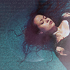
Fandom 10in30 icons
Apr. 18th, 2018 08:19 pm10 icons of River Tam from Serenity
made for![[community profile]](https://www.dreamwidth.org/img/silk/identity/community.png) fandom10in30 The challege was to make 10 icons from the same image
fandom10in30 The challege was to make 10 icons from the same image
Teasers:
( Read more... )
made for
Teasers:
( Read more... )


Brush Lettering- Post 1
Jan. 21st, 2018 07:15 pmI am learning the art of brush lettering.
I am still in the early stages and this post is intended more as a progress tracker. Below the cut is my first attempt at the full alphabet
( Post one )
New years resolutions
Jan. 3rd, 2018 08:32 pmI've made a few new years resolutions and I'm posting them here as a record.
1- To post to my journal more often
2- To get out more, be it to the cinema the local park or a place of intrest
3- To be more creative and spend more time on my Hobbies - photography, icon making, sewing, hand lettering and learning french
That's it just the 3 simple things I should be able to achieve that will hopefully lead to me feeling happier in life
Heres an icon I made tonight to help with goals 1&3. I know its just the one but they do say start small!
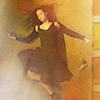
Beka's Birthday Bash
Jan. 2nd, 2018 09:24 pmFor

Title: Beka's Birthday Bash
Fandom: Andromeda
Rating:PG
Word count: 244
( Read more... )
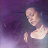
Sherlock wallpaper
Nov. 13th, 2017 08:13 pmTitle: Did you miss me
Artist: ascendant_angel
Rating: G
Warnings, kinks & contents: None
Characters and/or pairings: Moarity
Preview:

SaveClick for full sizeSave


Icon Tutorial
Apr. 20th, 2014 11:35 pmThis is for![[personal profile]](https://www.dreamwidth.org/img/silk/identity/user.png) skieswideopen who gave me such a nice comment about my use of textures in icons that I decided to write a tutorial.
skieswideopen who gave me such a nice comment about my use of textures in icons that I decided to write a tutorial.
Today we will be making this: icon.
icon.
Start by preparing you base as normal. I like to crop my icon first then brighten using an exposure layer, bump up the saturation and vibrancy, colour using a colour balance layer then tweak this with a selective colour layer if necessary. Finally I sharpen my my base by duplicating it running a high pass filter (set low), then setting that to overlay before flattening my base to finish. This is all personal preference there are many ways to prepare a base and they all give similar results.
My base looks like this:
Now the fun part! Pick a texture, a good tip is to pick one with colours that match your base image. I chose this one: by
by ![[deviantart.com profile]](https://i.deviantart.net/icons/favicon.png) angel_elf_icons at deviant art because it matched the blue in her outfit, then I flipped it upside down because I wanted the darker part at the bottom.
angel_elf_icons at deviant art because it matched the blue in her outfit, then I flipped it upside down because I wanted the darker part at the bottom.
Next drag your icon base over your texture (or drag your texture over your icon base before moving it down, setting it as a new background) and erase the icon bases background, resize your image positioning in the middle. I like to work at view size 200% for this bit so I can see clearly but again that's personal preference.
Now my icon looks like this: next I took another texture byangel_elf_icons
  and set it over the top set to screen 100%.
My icon now looks like this: which is nice, but I wanted my background just a little darker so I duplicated the last texture dragged it to just over the first layer (your1st texture) and set it to multiply at 35% opacity.
My icon now looks like this: its a subtitle effect but looks better especially on the top left hand corner.
Now however the effect on her face is too strong so I take a basic brush set to 0% hardness, and 11% opacity and erase the top texture off her face.
My icon now looks like this: again its a subtle effect. Now you could stop here but I wasn't happy with the colouring I wanted some pink/purple undertones to warm it up a bit. Again there are many ways to do this, I made sure my top layer was selected then went to image adjustments > variations > more red.
Now my icon looks like this: which I was happy with so we're done!
I'm new to tutorials so please let me know what you think, and if anything wasn't clear.
Today we will be making this:
icon.Start by preparing you base as normal. I like to crop my icon first then brighten using an exposure layer, bump up the saturation and vibrancy, colour using a colour balance layer then tweak this with a selective colour layer if necessary. Finally I sharpen my my base by duplicating it running a high pass filter (set low), then setting that to overlay before flattening my base to finish. This is all personal preference there are many ways to prepare a base and they all give similar results.
My base looks like this:
Now the fun part! Pick a texture, a good tip is to pick one with colours that match your base image. I chose this one:
by Next drag your icon base over your texture (or drag your texture over your icon base before moving it down, setting it as a new background) and erase the icon bases background, resize your image positioning in the middle. I like to work at view size 200% for this bit so I can see clearly but again that's personal preference.
Now my icon looks like this:
next I took another texture by and set it over the top set to screen 100%.My icon now looks like this:
which is nice, but I wanted my background just a little darker so I duplicated the last texture dragged it to just over the first layer (your1st texture) and set it to multiply at 35% opacity. My icon now looks like this:
its a subtitle effect but looks better especially on the top left hand corner. Now however the effect on her face is too strong so I take a basic brush set to 0% hardness, and 11% opacity and erase the top texture off her face.
My icon now looks like this:
again its a subtle effect. Now you could stop here but I wasn't happy with the colouring I wanted some pink/purple undertones to warm it up a bit. Again there are many ways to do this, I made sure my top layer was selected then went to image adjustments > variations > more red. Now my icon looks like this:
which I was happy with so we're done! I'm new to tutorials so please let me know what you think, and if anything wasn't clear.
Oh I haz Dreamwidth too, iz forgot.
Sep. 5th, 2010 11:02 pmHaving forgot I have an account here I am back with icons from Season 3 of Andromeda.
Total Icon Count: 62
Teasers:


